
The way you measure your projects’ progress depends on a lot of factors — your industry, your team, your chosen methodology, and lots more.
There are plenty of types of charts to choose from to display your progress as you go, including Gantt charts, PERT charts, Pareto charts, flowcharts, and many more — but if you and your team like to go Agile, a Burn-Down chart may be the best fit.
A burn-down chart is a simple line chart that tracks and forecasts your project progress.
Essentially, it’s a visual representation of how much work you need to complete to meet your goals, so you can see if you’re on track.
Many project managers can draw a simple burn-down chart, but when it comes to interpretation, not all of them can fully understand its capabilities.
In this guide, I will cover:
- How to interpret the key components of burn-down charts
- Common pitfalls to avoid when tracking your project progress in a burn-down chart.
What is Burn-Down Chart?
Burndown charts get their name because the number of tasks, or work hours will go down as your team “burns through” the activities in a project phase.
The project manager starts at the upper left-hand corner of the chart, before any development work is completed and as features are completed or “burned down,” the project manager tracks that progress with a simple line chart.
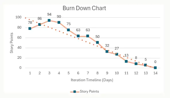
On X-axis is total duration of your sprint. On Y-axis is the story points/ work to be completed during a sprint.
In this example, the project manager is tracking a iteration, which contains a total of 622 features, or story points, that the team must “burn through.”
A burn-down chart can also track the progress of an release by substituting “number of iterations” for “iteration days” on the y-axis.
As features are built and tested, the number of story points remaining is plotted and a line connecting each point is drawn.
By keeping the burn-down chart current, project managers can offer their customers a quick, visual representation of the functionality that has been delivered and is left to be delivered, and provides clues regarding the team’s productivity.
How to Read Burn-Down Chart?
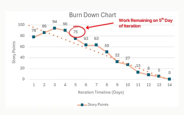
Every point on a Burn-Down chart signifies how much Actual Work Remaining of the total you started with. The work can be in terms of story points or in terms of actual number of hours
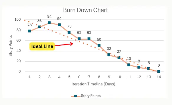
The Ideal Line on Burn-Down Chart
The “ideal” line in a burn-down runs diagonally from the top left corner to the bottom right corner.
The “ideal line” indicates precisely the average number of points that must be “delivered” per day to reach the project or sprint goal in the set time.
Measuring Project Progress using Ideal Line
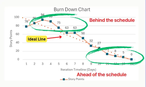
When reading the graph, use the “ideal line” as follows:
- The distance between the real line (below or above) and the ideal line indicates how much the project is ahead or behind in the planning.
- If the actual line is above the ideal line, the project is running behind schedule.
- If the actual line is below the ideal line, the project is ahead of schedule.
If the chart is a flat line and not moving down toward the zero point in the lower right-hand corner, it shows that the team is stuck and not able to make progress as expected.
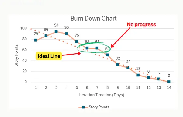
It sends a signal to the project manager that a technical issue, an organizational barrier, or a teammate’s productivity requires attention.
How to Find Scope Addition using Burn Down Chart?
If the plot moves upward, it indicates that new features have been added to the backlog, or features previously considered complete have moved back to development.
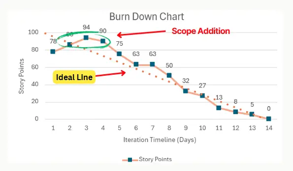
In agile development, a new feature added to an iteration can mean many things: it can be a positive sign of fruitful interaction with the customer or it can be the first indication of scope creep or project gold-plating.
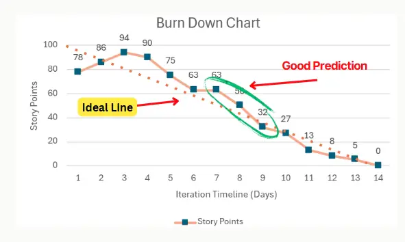
A Good Prediction
The burn-down chart is also very revealing in regard to the team’s estimating success.
If the plot is proceeding as expected, and the trend line is an even, steady descent from the top left-hand corner to the bottom right, this signifies that the team has been successful at predicting its velocity and selecting the right features and right number of features to include in the iterations.
If, on the other hand, the line is choppy, sloping up and down and stalling frequently, it can indicate that the team is not predicting correctly, or that unforeseen complexities are arising that must be addressed.
Burn-Down Chart – Ground Rules
An upward tick in the burn-down chart signifies that a feature previously considered complete has moved back into the unfinished column and is a negative indicator.
Features should only be burned down on the chart if they are developed and tested and ready to be integrated into the iteration or release.
Counting unfinished features creates all sorts of complications, from damaging internal team trust to corrupting the entire burn-down process. Project managers should set clear rules regarding the state of completion required before a feature or story point is counted as burned down.
Burn Down chart – Common Pitfalls
- Burn Down chart don’t tell the whole story. Your number of remaining tasks can decrease because you remove a task from a sprint. Your actual effort line can be below your ideal line because you overestimated the time a project will take rather than because your team has worked extremely well together. There’s no way to tell which is true based on the chart alone, and this can make it harder to find the problems you need to address if the gap between the lines starts to widen.
- Burn-down charts don’t track work in progress accurately. You won’t be able to see which tasks have been started, how close they are to completion, or predict when dependent tasks will be completed during a sprint. This can make it difficult to plan for the end of your project and can lead to bottlenecks.
- Burn-down charts depend on accurate and up-to-date data. If you don’t have a solid overview of how your tasks are moving through your workflow, you won’t be able to plot the actual effort line accurately, and your burn-down chart won’t give your team the transparency they need to plan their work.
Summary
A burn-down chart is a visual tool used in agile project management, to track the progress of a project over time. It shows how much work remains versus the time left in a sprint or project.
It helps team monitor progress, identifies if team is on track to complete the work and highlights bottlenecks or delays early.
References
Agile Practice Guide– PMI Practice Guide


